Merrill Edge
In August 2016 I took a contract position doing web coding and design work for Merrill Edge. Working on a massive enterprise web site was an adventure, very different from the freelance work I was doing.
I was hired to simply code up web pages, but I ended up doing much more:
- Spearheaded the conversion of over 150 articles to responsive design. I helped design the template and did most of the post-design refinement. I developed templates for the other members of the coding team, and also prepared a design and process guide.
- When my boss learned that I had design skills, he began giving me little design projects. [Merrill Edge has a UX department; they handle large design tasks with long lead times.] I created mockups and did coding for concept pages, random page modules, rush micro-design work, tables for static pages and articles … even a logo for our Agile team!
- My ability to teach myself cutting edge web coding techniques, then explain them to others, changed the way our coding group handled several tricky coding problems.
Web Stories
A Tale of Two Tables
Financial information is all about the numbers, and that means tables. Merrill Edge has its share. When I started work, the tables we used were in many different styles, some coded well, others were surprisingly bad. I gave myself the task of improving our tables.

My first job was to create a simple table that would work on responsive pages. I developed the one you see to the left. They styling is minimal, but the table would grow and shrink with the size of the browser window — without media queries or excessive CSS.
I then went on to incorporate the styling developed by the UX team. This styling had been used in tables before; with almost 300 lines of CSS code, 6 media queries, and <div> within <div> within <div>. [If you don’t understand CSS talk, the previous sentence can be read as “really, really, really complex”.]

I was able to shrink the coding down to 13 lines of CSS, no media queries, and no internal <divs>.
“‘Twas the workday before Christmas…”
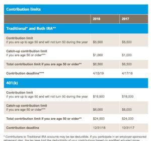
And one of the content editors realized we needed to update an article on retirement contributions fast. The task included not only edits to the text, but a complete reworking of the complex table with new information. I had 3 hours to turn this around … and I made it!
You can see this table live. Be sure to vary your browser width to see the responsive action.

Gallery
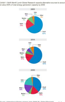
Here are some images and screenshots of other work I did at Merrill Edge.


